Decide. Commit. Repeat.
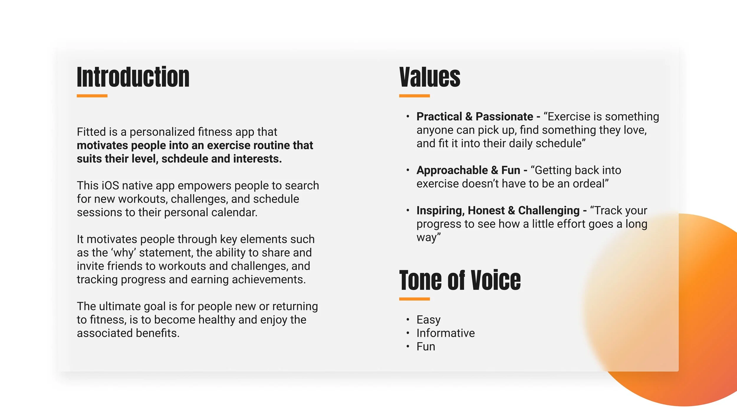
Find new workouts that fit into your schedule, meet you at your level, and motivates you to reach your goals.
How do people - new or returning to fitness - find new workouts? What motivates people to achieve their goals? How do busy people prioritize working out and foster new routines? Fitted is a conceptual iOS native app that strives to provide such a solution.
Project Background
ROLE: UI Designer
TYPE: Academic (Solo Project)
TIMELINE: 2021 (2 months)
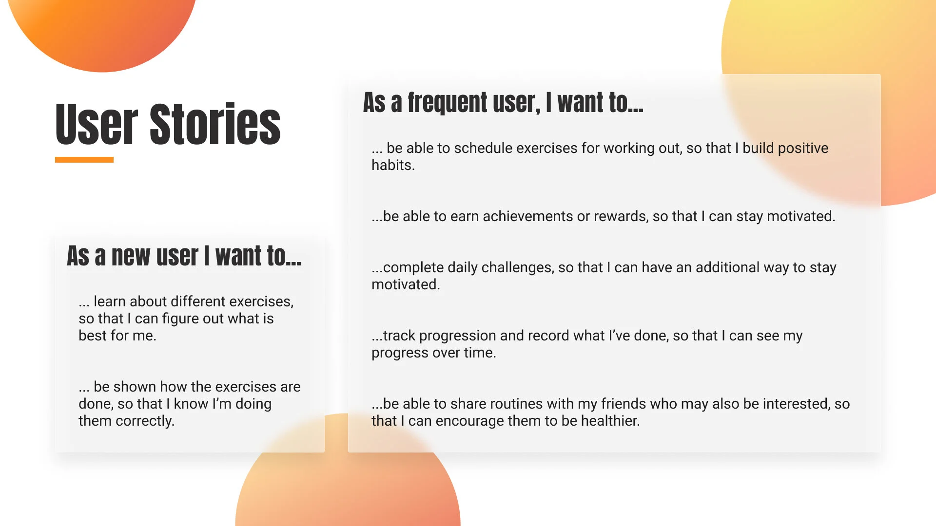
This solo project took place over two months of CareerFoundry's UI for UX Designers course. The project's persona and user stories were established; as the UI Designer I translated those stories into user flows that evolved into the solution and a design system to support further iterations.
Key Requirements.
The solution must include a way for people to find activities of interest and personal fitness levels; participate in challenges, and keep a schedule by adding sessions to a calendar. Ultimately the solution should motivate people into a routine to become healthier.
The Result.
Fitted is a conceptual, interactive iOS native app with mockups for a web-app version for tablet and desktop devices. Find workouts with or without equipment, with various intensities and duration; commit to daily/weekly/monthly challenges and invite friends to up the ante; build healthy habits with encouraging reminders to get moving.
-01-
DISCOVER
PROJECT CONTEXT
“About one in four American adults spend at least eight hours per day sitting”
— Leslie Young, Global News
Why is this important?
If the 8+ hour workday is primarily spent screen-side, and if you do not have a standing desk, chances are you will be sitting 8+ hours a day.
What are the challenges?
What prevents people from working out to counteract adverse health effects of prolonged sitting?
It's no secret that prolonged sitting has adverse health effects.
WebMD and various news and medical sources suggest that sitting too much can lead to increased risk of heart disease, dementia, diabetes, weight gain, anxiety, osteoporosis, and a slew of other health effects. According to the Mayo Clinic, "an analysis of 13 studies of sitting time and activity levels found that those who sat for more than eight hours a day with no physical activity had a risk of dying similar to the risks of dying posed by obesity and smoking" (Edward R. Laskowski, M.D., 2020). Yikes!
This risk resonates with me.
Desk work isn't new, but it is on the rise. Through the pandemic about 40% of Canadians are now working from home (Celine Zadorsky, CTV, 2020), and the nature of this working condition can come with excessive sitting, which is listed as one of "the 7 hidden health dangers of web design" (Inkbot Design, 2019). As someone familiar with a desk job and now entering the design field, this nefarious working condition trade off is not lost on me.
No shortage of barriers.
Common barriers to working out can include lack of time, lack of motivation, lack of resources/equipment, lack of know-how, fear of injury, lack of support. For every barrier, there is a way to overcome it.
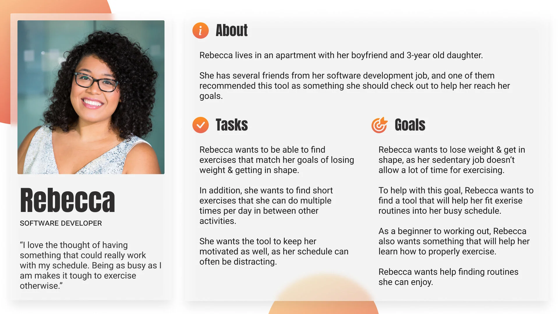
Fitted's persona represented the challenges, conjured empathy, and was foundational to the conceptual solution.
-02-
DEFINE
PERSONA
Focusing a specific user helps keep her needs top of mind and limit distraction for a new feature or demand.
Please meet Rebecca, a busy mom & Software Developer.
-03-
IDEATE
USER FLOWS
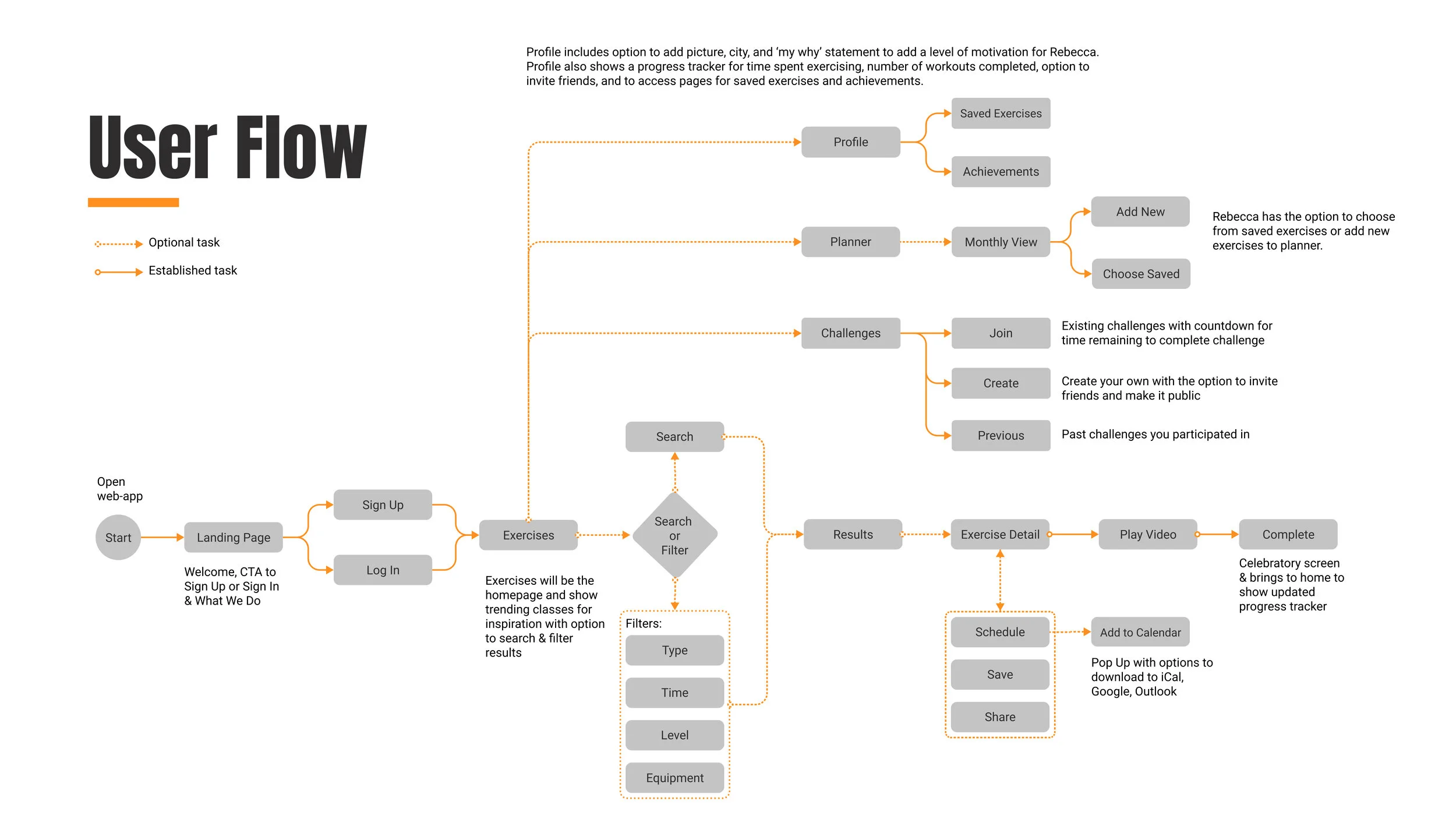
Visualizing Fitted’s Flow
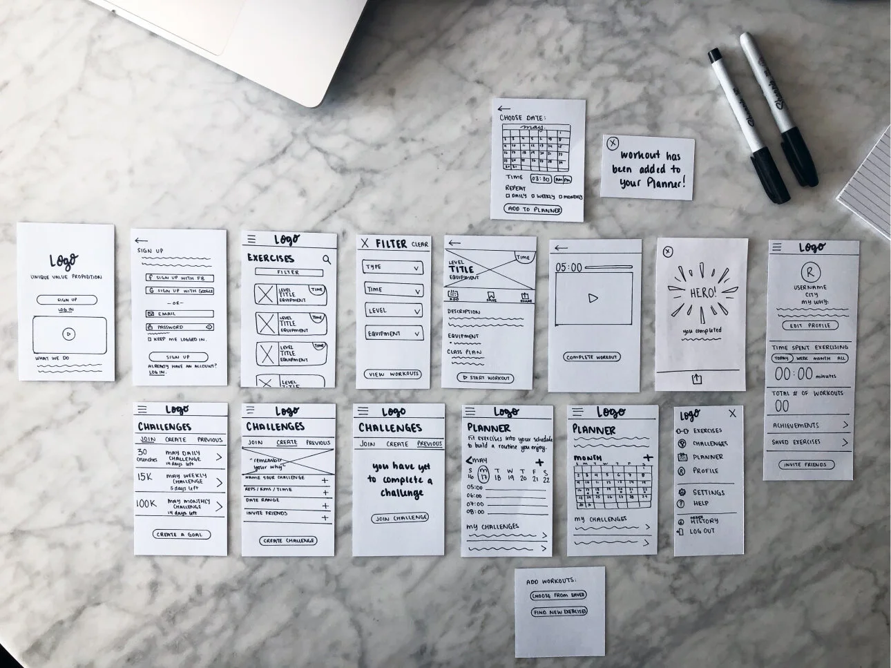
Understanding why Rebecca needed a solution allowed me to focus on creating a valuable product to serve those motivations. With goals, tasks and stories and mind, I mapped out the basic functionality and flow of the app. I sketched wireframes onto cue cards to get a sense of content blocking and translated the ideas into a digital user flowchart.
Curious to see all my low-fidelity sketches? Please follow the links below.
The Original
Onboarding
Profile + Achievements
The visual guide provided the blueprint of the solution.
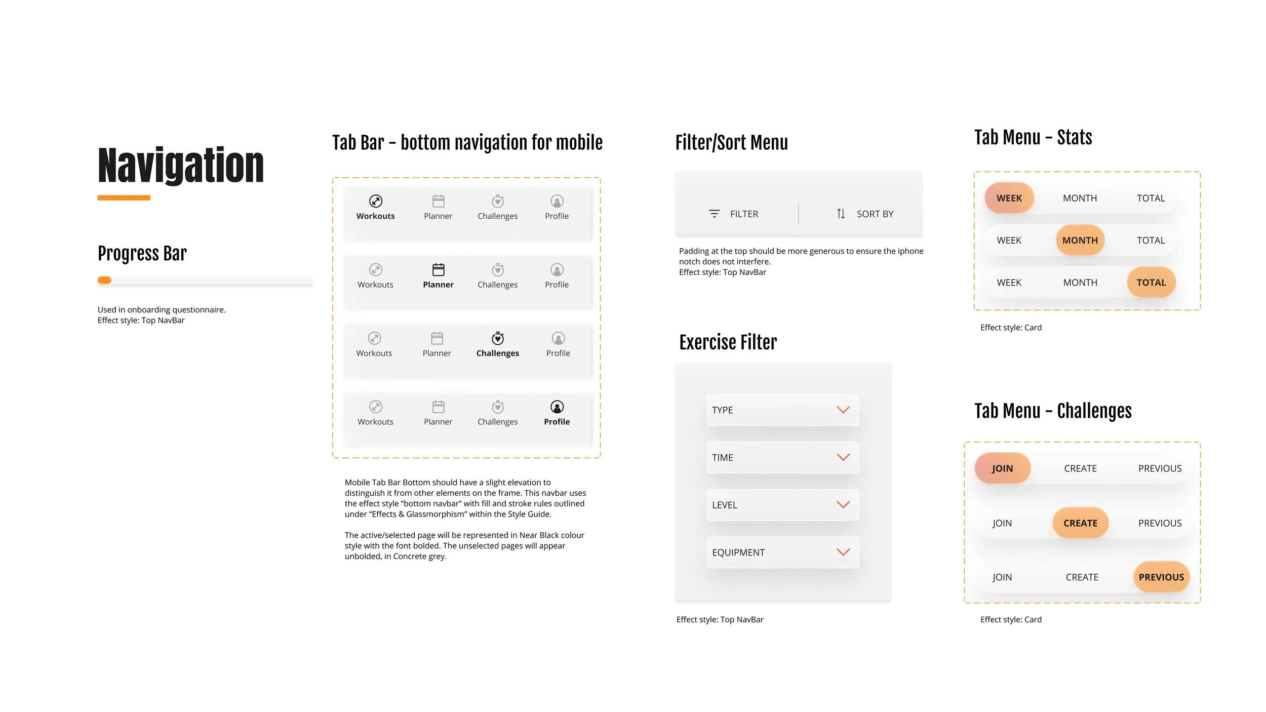
There was, however, a prominent change of navigation moving the top bar with hamburger menu to a bottom tab bar with icons. This was a result of product requirements shifting from web-app to native. I channeled the blueprint into designing the product with Figma.
-04-
DESIGN
GRIDS, ELEMENTS & FILE ORGANIZATION
Foundations
Grid Anatomy
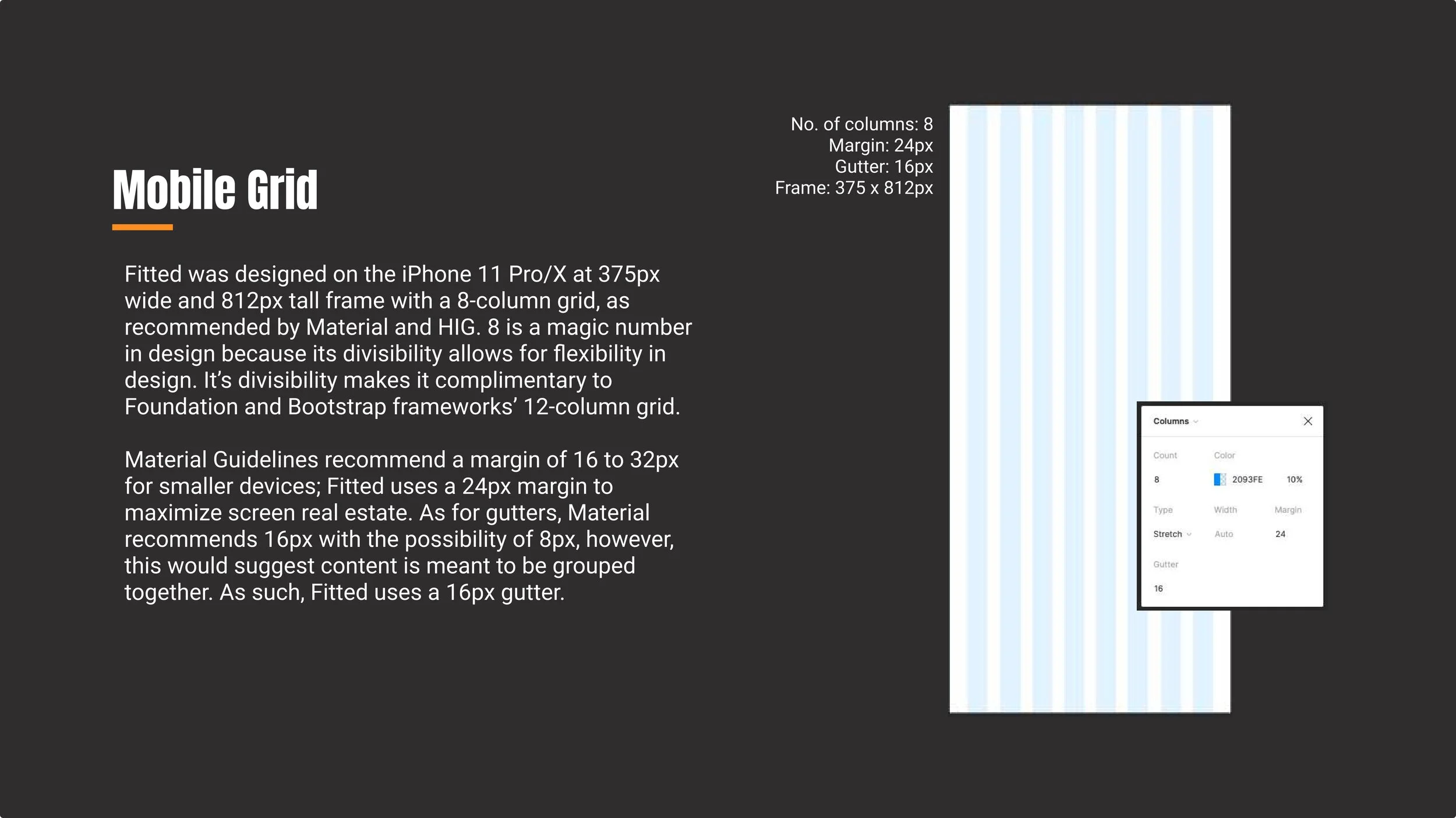
Once the low-fi wireframes were sketched, I created my organizational system, the (fluid) grid, to bring structure to my responsive design.
Using the iPhone 11 Pro/X at 375px wide and 812px tall for my frame, I created a 8-column grid as recommended by Material and HIG. Eight's divisibility makes it adaptable for Foundation and Bootstrap frameworks’ 12-column grid. Margin is set at 24px and gutters at 16px.
Mise En Place
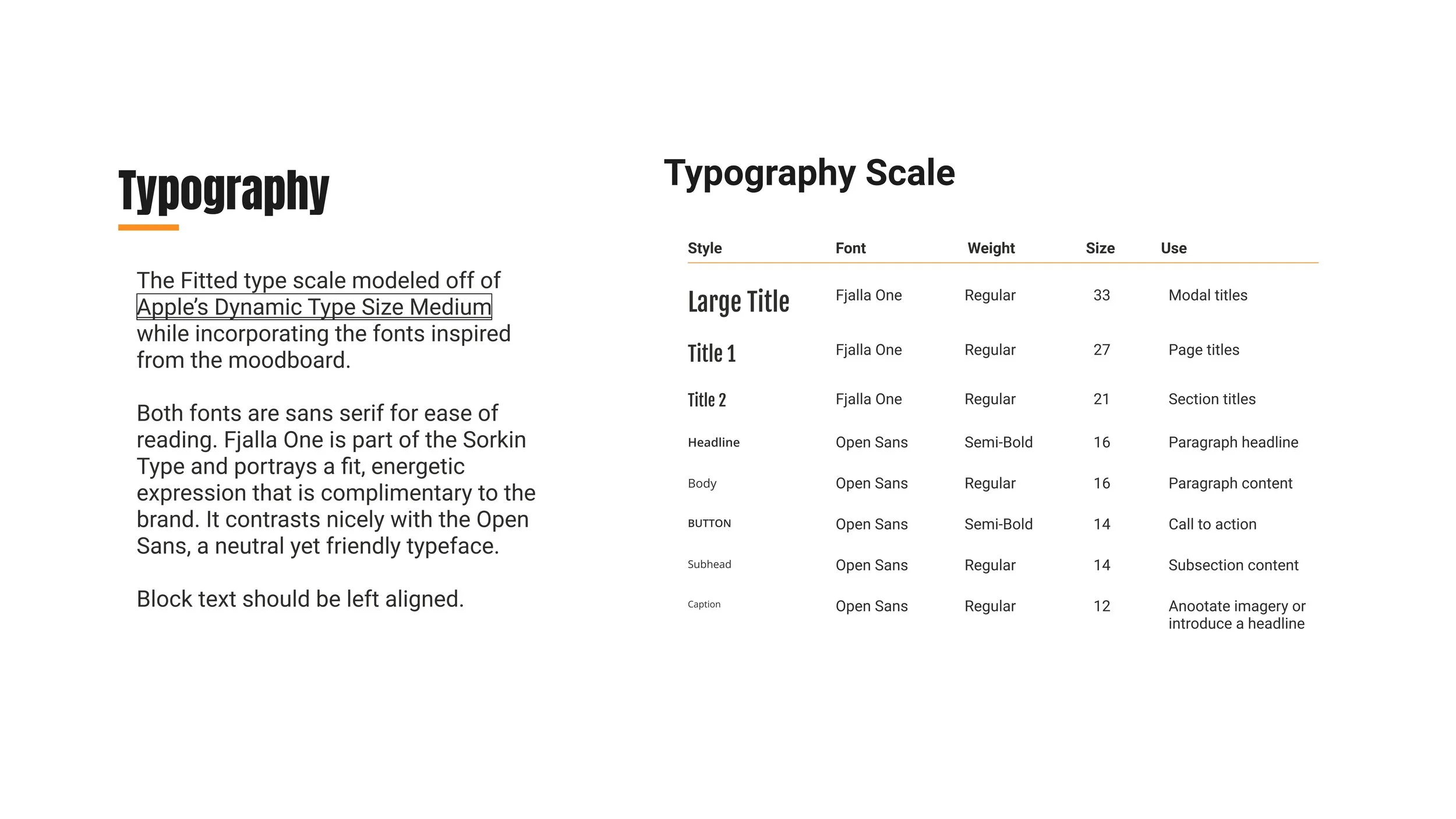
Using the atomic design methodology, I could create and reuse components, which could help with a cohesive user experience and efficiency in designing the product.
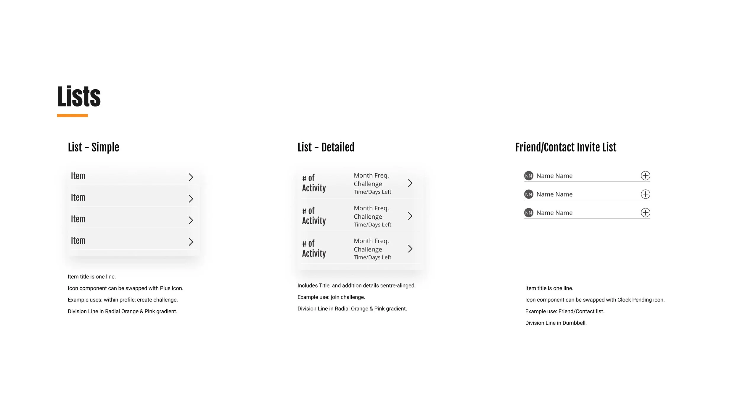
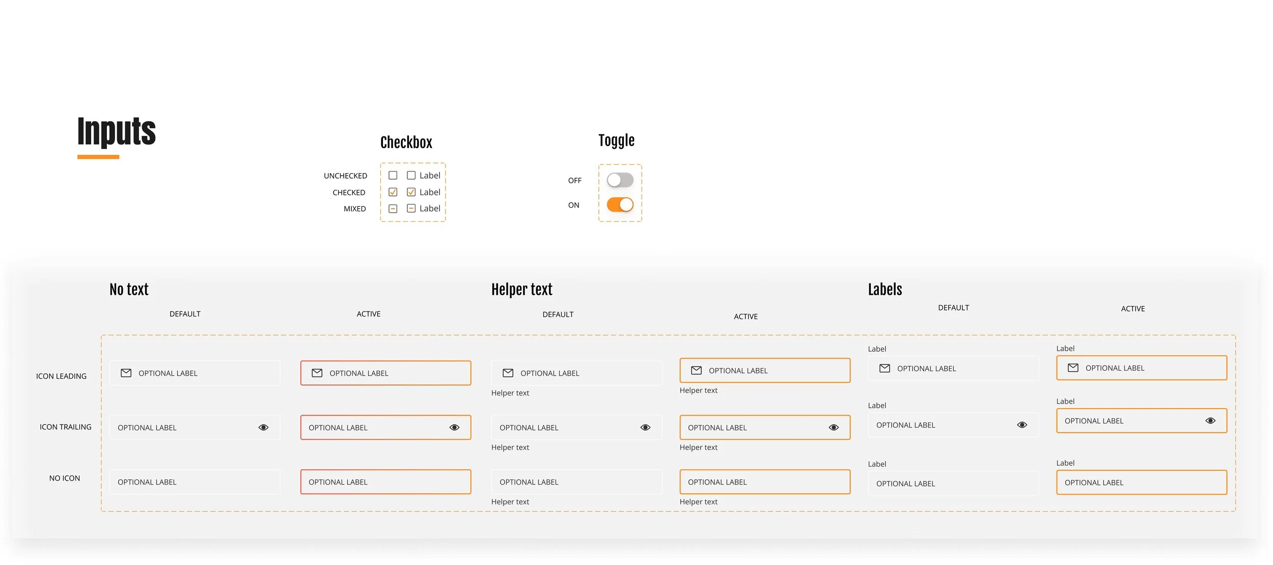
I consulted my sketches for all the various components I would need to create for the app. I then created my atoms and molecules of buttons, inputs, icons, navigation and other reusable elements such as cards, some with variants. These came together as organisms of frames.
Layer Organization
I utilized slash naming components for my frames and for the layers within each frame. Slash naming conventions were also used in components, which were helpful in creating variants.
For a more detailed look at my organization, please view my Figma file for Fitted’s Design System.
MOOD BOARD, ITERATIONS, DESIGN DOCUMENTATION
Visual Implementation
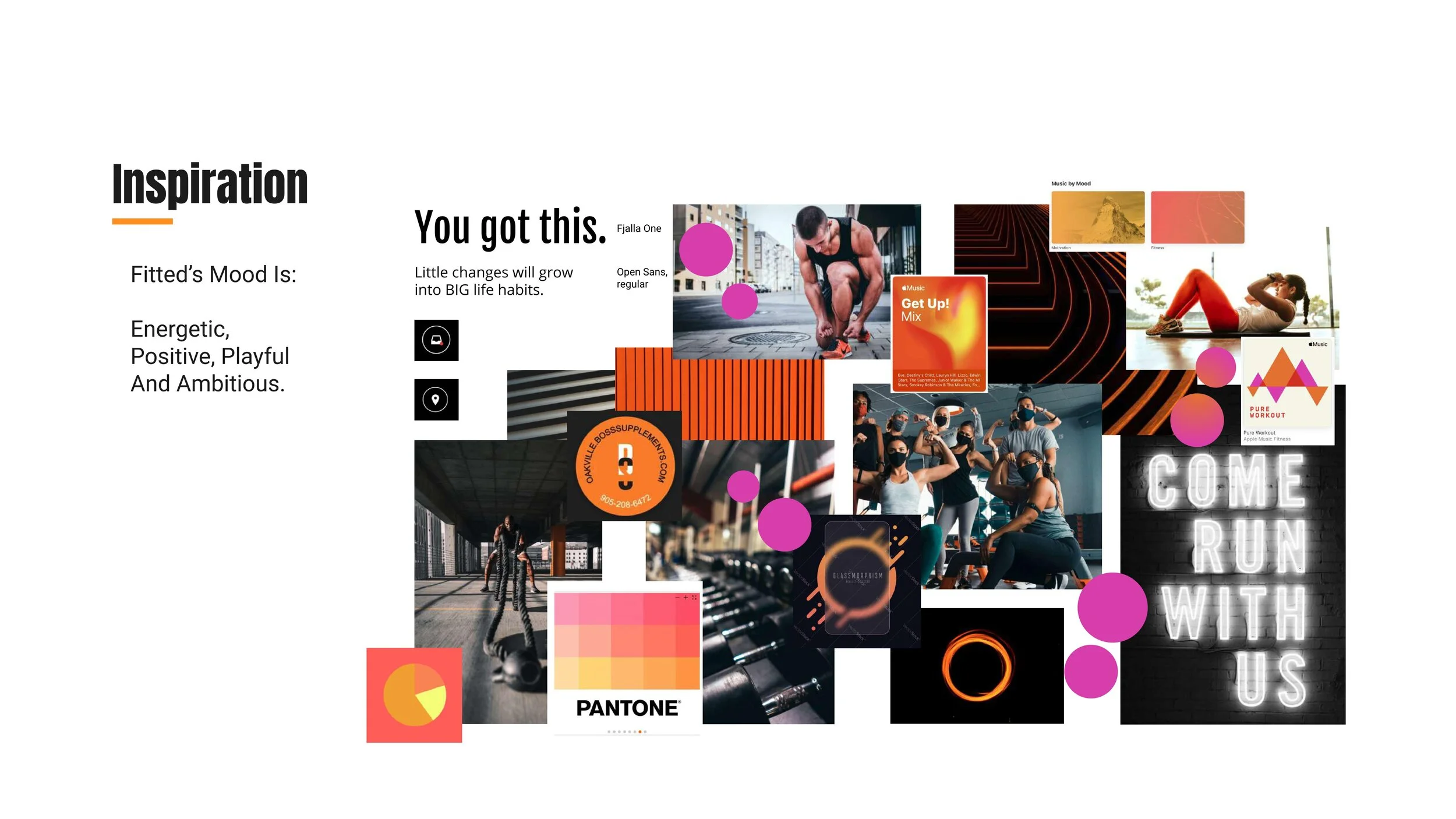
Mood Board
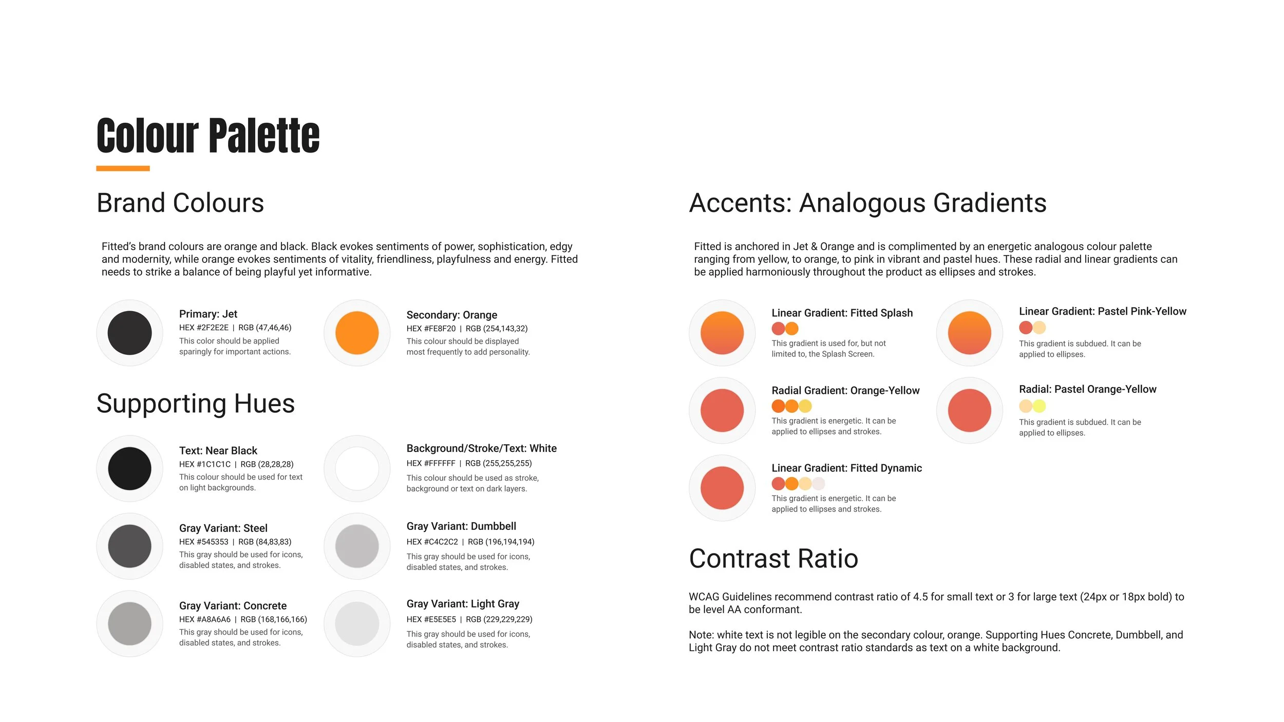
Before getting started with the visual design I consulted the project brief again to prioritize the partial branding guidelines for key messaging and style. Fitted needed to be easy, informative, fun. Fitted also had to be anchored in the brand colours, orange and black.
I created two different mood boards, followed by an informal preference test with 10 participants, one of which is a seasoned personal trainer who has a track record of motivating people to reach their goals. From the results came a hybrid mood board (below) to support Rebecca who wants motivation to improve her fitness one workout at a time.
Iterating with Glassmorphism Style
Knowing that I wanted to glassmorphic style to reinforce Fitted's energetic brand, I explored different design applications. From initial attempts to the current version, you will see spherical shapes. The spheres/ellipses were important to the design for two reasons: glassmorphism and the brand. The spheres layered behind the frosted frames helped punctuate the glassy style. For the brand, the spheres symbolize unity and cyclical energy flow that lends itself to the active nature of the app, and the potential to connect with friends through fitness.
-
First Attempt
Initially my glassmorphism style rested heavily on the tenets of colour, gradients, and geometric elements. My hope was to create a feeling of movement, however, I ended up producing something that was, well, a little garish, and ultimately distracting.
-

Current Version
In the next iterations I simplified my approach to glassmorphism by editing my gradient colour styles to be more subdued. I also set effect styles in my Figma file to deliver consistency in the elevation and background blur that would be paired with 50% opacity fill and a stroke/border to create the illusion of frosted glass floating above gradient colour spheres.
Design Documentation
The primary objective is to motivate users with a playful and informative experience while pursuing their health and fitness goals. In order to do this, I focused on creating an engaging interface with application of the orange and black brand colours on abundant white space, and an approachable tone. Colours were thoughtfully applied to meet WCAG contrast ratio accessibility standards.
DESIGNING FOR DIFFERENT BREAKPOINTS
Responsive Design
Mobile
iPhone 11 Pro (375 x 812px)
8 Column Grid
Margin: 24px
Gutter: 16px
Tablet
iPad Mini (768 x 1024px)
8 Column Grid
Margin: 24px
Gutter: 16px
Desktop
Desktop (1440 x 1024px)
12 Column Grid
Margin: 24px
Gutter: 24px
-05-
DELIVER
Profile: A Place of Motivation
Why Statement
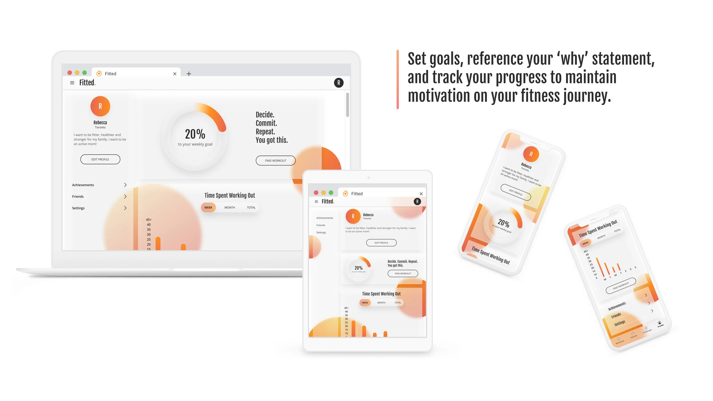
Rebecca will be greeted with her ‘why statement’ that she created during onboarding. To reference Simon Sinek, ‘start with why’ provides purpose, inspires action, and will connect with a deeper source of motivation. Fitted taps into this to remind Rebecca why she started on this fitness journey.
Track Progress
Rebecca wants a way to track her exercise efforts so that she can see progress over time. Rebecca also expressed that she wants to do short workouts multiple times a day. This is why I have shown her workout stats as Time Spent Working Out and Number of Workouts Complete in relation to the goal she set in onboarding.
Earn Achievements
Rebecca expressed that she wanted a way to earn achievements or rewards. Fitted users earn achievements for various work out milestones. This gamification adds a layer of motivational support for Rebecca to reach her goals.
Workouts
Finding New Routines
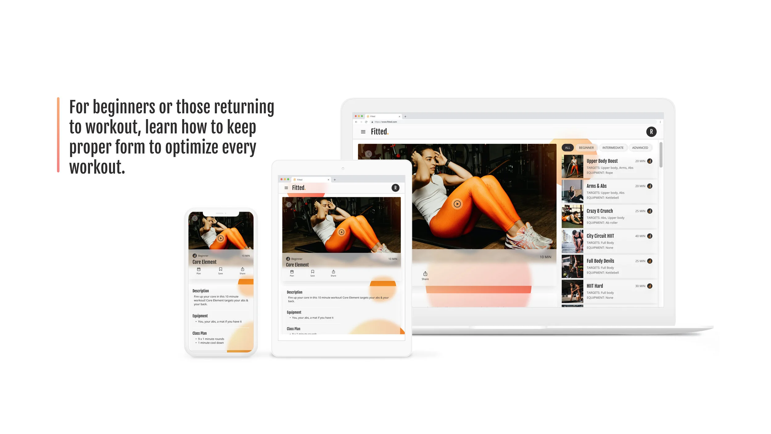
After onboarding, Rebecca will be brought to the Exercises page; this will also be the first page she will see when she logs back into the app. By going right to the Exercises page, Rebecca can get started with finding exercises.
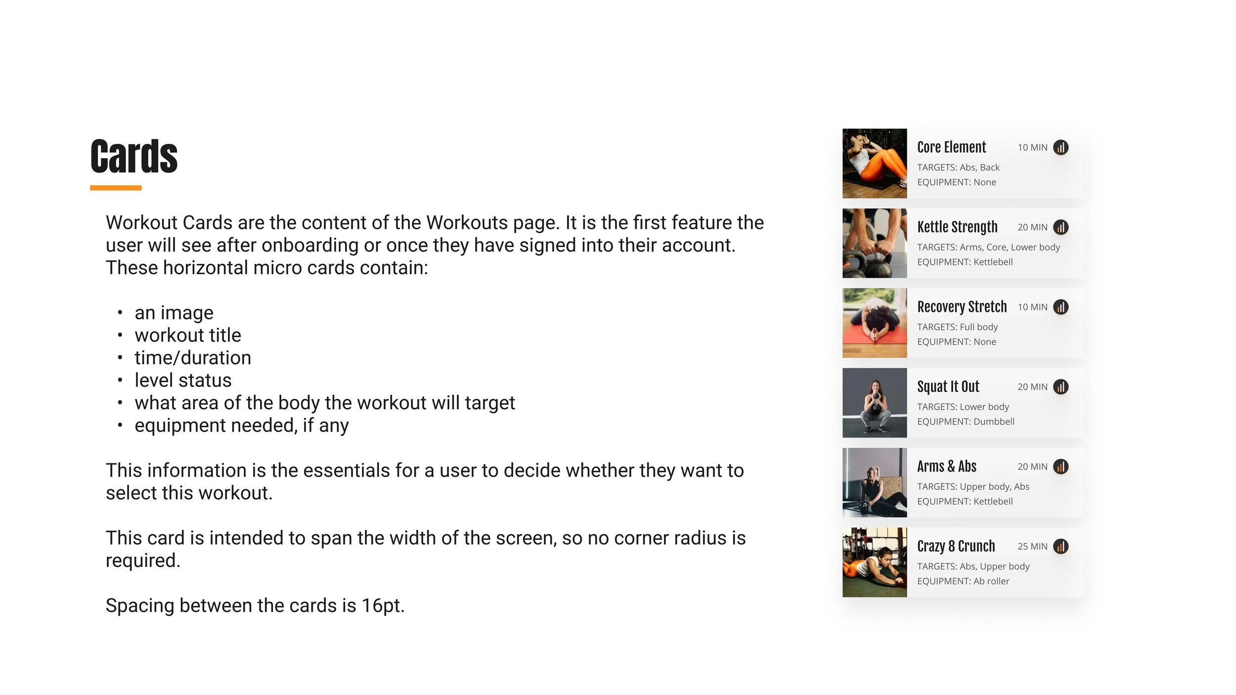
The default display of exercises are recommendations based on the onboarding survey. These are meant to inspire new options and they highlight the essential information of title, level, equipment and time duration. She will also have the option to search and filter exercises before selecting and completing the workout.
Share With Friends
Rebecca wants to share her routines with her friends. Fitted allows Rebecca to share the individual workout page details and/or share her “hero!” success message after the workout is complete.
Note: It's not currently possible to switch between orientations within a Figma prototype. The workout video would typically be played in horizontal orientation.
Planner
Plan For Success
Rebecca has a busy schedule. She wants to be able to schedule exercises for working out to build positive routines.
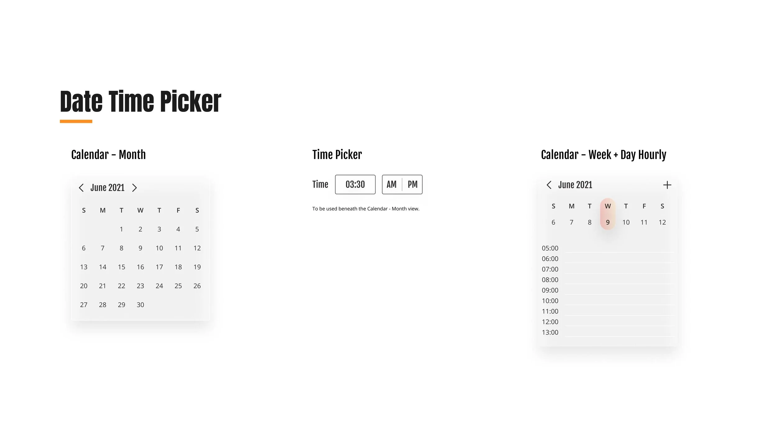
In the app, Rebecca will be able to schedule exercises and see an overview of what she has planned, along with the challenges she is participating in. She can also choose to schedule workouts right from an individual workout.
Challenges
Join, Create, Track
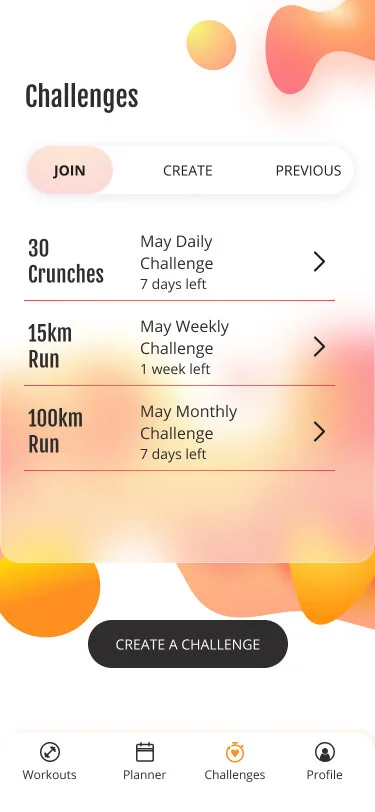
Rebecca wants to participate in challenges as an additional way to stay motivated. Fitted offers daily, weekly, and monthly challenges that can be joined at any time. There is also the option to create custom challenges with a unique name, duration, date range, and the option to invite friends. Finally, the previous tab shows all challenges that Rebecca takes on. Whether or not she completes them, she can see which she has started and how far she got in completing that challenge.
The Solution
Fitted supports you in your fitness journey with dynamic workouts and challenges that can be scheduled in advance or picked up on the fly. Tracking these efforts will prove that little changes will grow into BIG life habits. You got this!
Takeaways
Atomic design supports efficiency.
Creating a Mise En Place of reusable components and styles throughout the design was incredibly helpful for efficiency of changes as the UI changed. I set styles for preliminary font hierarchy, primary and supporting colours, and border/stroke styles. If I were to go back, I would have also initiated gradients. in my colour styles along with elevation and background blur in effects to help in creating consistency and allow for easy iterations.
Variants, also super efficient.
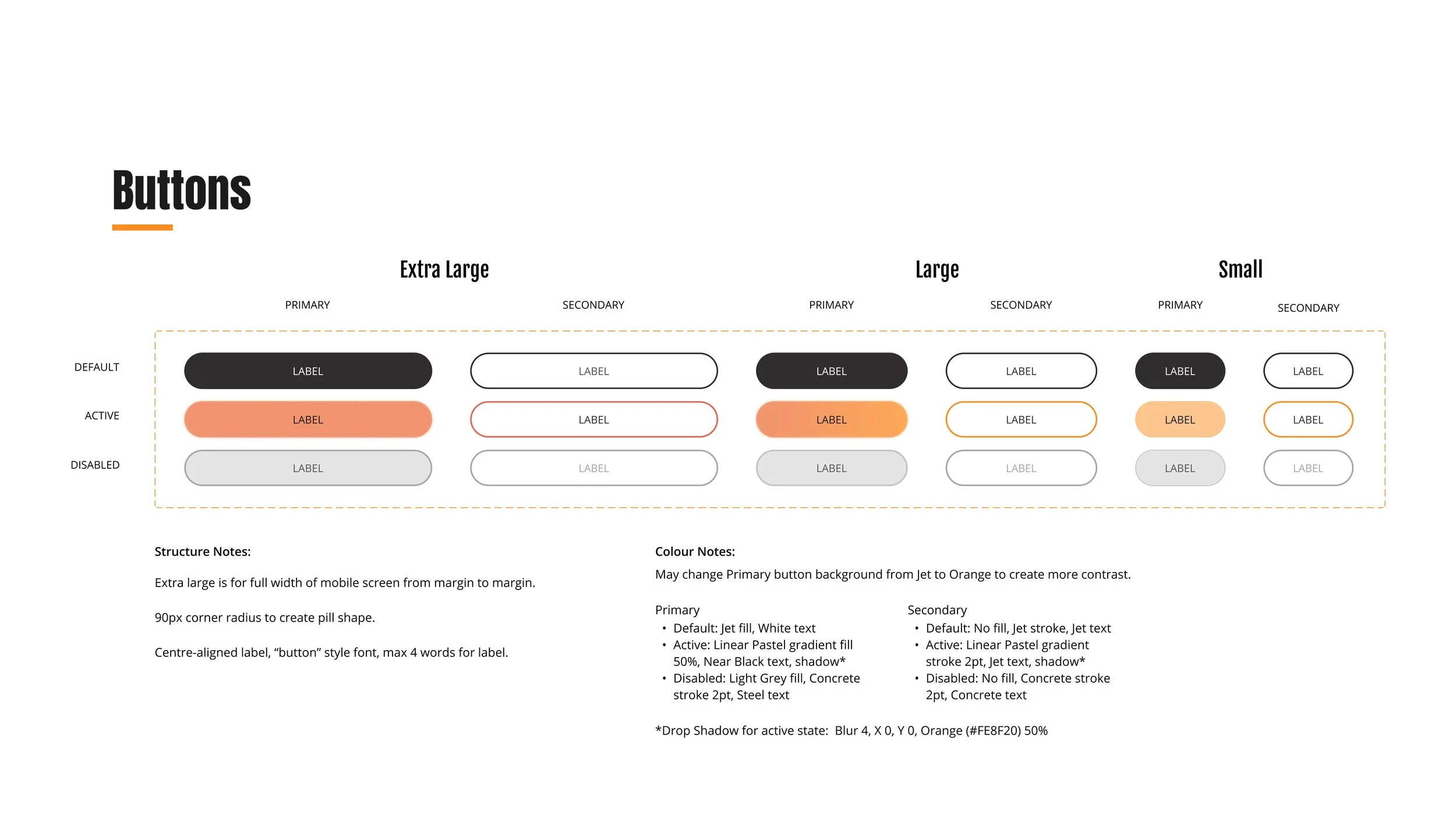
Figma’s variants helped me organize various properties of a component and easily change from one variation to another. For example, when designing a frame I can input a default button, but then change the type (primary or secondary), size (XL, large, small), and state (default, active, disabled) depending on the use case. I also created variants for inputs and tab bars.
I am excited to learn more about iconography, glassmorphism & animation!
Creating many of the icons for Fitted’s interface (all but the social icons) was a thoughtful process that challenged restraint in 24x24 pixel grid. I have more to learn about utilizing boolean operations.
Glassmorphism’s playful style is difficult to achieve! From my early versions of the UI to the current version, I really grappled with colour application and layers. Initially I ran with vibrant colours and multiple layers and this organic shape ‘artwork’ throughout the interface that left me feeling frustrated and distracted. In an overhaul, I exercised some restraint and leaned on white space with pops of colourful (subdued colourful) in the ellipses to create cohesiveness among frames of all breakpoints. Colour is complicated! And I can’t wait to learn more about it in digital applications.
Animation, subtle and grand, adds delight to the experience. Fitted uses subtle animation in screen transitions. I hope to continue to grow in this space.

