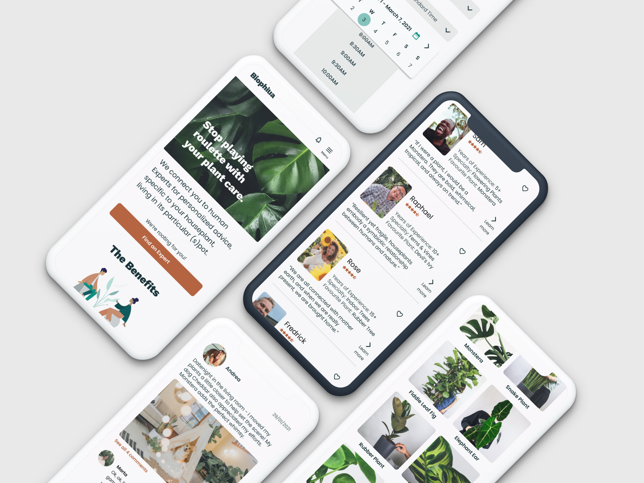
Personalizing Houseplant Care
Taking out the guesswork of houseplant care with personalized, expert advice.
Existing houseplant resources are generic, conflicting and confusing.
Not to mention that each plant and its home environment is unique.
I endeavoured to solve this problem with my conceptual web-app, Biophilia.
Project Background
ROLE: UX Researcher & Product Designer
TYPE: Academic (Solo Project)
TIMELINE: 2020-2021
This was a solo project. During my UX program with CareerFoundry from 2020-2021
I performed research, established the design system and service offerings, and iterated the structure. I conducted usability tests and refined the design.
Key Requirements.
This responsive web-app must include a way for users to browse expert profiles, pose a question for free, book a video call, and pay for the expert’s service.
The Result.
Biophilia is a conceptual, interactive web-app prototype that connects you with experts for personalized houseplant advice. It also offers a way to level up your plant knowledge and connects you with a community of fellow houseplant enthusiasts.
-01-
DISCOVER
PROJECT CONTEXT
“Becoming a ‘plant parent’ seems to be all the rage now for 20- to 35-year olds. Millennials love plants so much, that in the last three years, houseplant sales in the U.S. have increased 50 percent to $1.7 billion.”
- Bianca Bharti, National Post
Why is this important?
Houseplants are more than a trend; they add immeasurable value to the quality of life.
Pandemic lockdowns showed just how important houseplants are to our well-being.
Amidst the pandemic, taking care of houseplants provides a form of therapy that also creates an indoor sanctuary; and this has contributed to the plant industry demand, which is expected to grow by $29 billion over the next 4 years (Katie Parks, The Philadelphia Inquirer, 2020). Pandemic aside, it’s hard to deny the innate joy people feel when they’re with nature, especially when nature is sparse in the concrete jungles where many work and live.
Houseplants are a feel-good project that usher us back to our roots in nature.
I feel this astonishing trend of houseplants is an articulation of what Harvard naturalist Dr. Edward O. Wilson conceptualizes as Biophilia: the human desire to commune with nature. Could my product help celebrate, support, and nurture that connection with nature? How could it help keep houseplants, people’s emotional and monetary investments, thriving?
What are the challenges?
So what happens when you have a question about caring for houseplants? What existing solutions are out there?
Care is essential, it can also be confusing and costly.
So what happens when your $70+ ficus is showing signs of death? I downloaded some top-rated houseplant care products such as Planta and PictureThis, both of which have premium subscription fees, to understand what they offer. They offer a plethora of information on plants and care instructions, plant species identifier, chat bot to identify illness, and calendar care reminders. The alternative is to watch lengthy 30+ minute long YouTube videos for a morsel of generic advice, google for help, or read books and blogs to learn more independently.
Current houseplant apps are so focused on feature abundance for a turn-key solution that personalized care advice is lost.
Planta app includes “Dr. Planta” with their paid subscription; but this turns out to be an AI chat bot with pre-determined possible problems. The app PictureThis offers “exclusive consultations” service for paid memberships; however, this is limited to 3 tips from experts that is facilitated through an email form with no ETA for response. Is this as good as it gets?
RESEARCH
Why do research? Who am I solving this for? What is my method? How can I understand my users?
Being a houseplant ‘parent’ myself, I wanted to test my assumptions and remove any bias for understanding the problem. So I reached out to millennials interested in houseplants, who have sought advice or information on houseplant care to conduct discovery research. I hosted 4 interviews (~45min/person) to understand my target audience with the following research goals:
To better understand user behaviour around seeking houseplant care information and advice.
To understand the challenges users have with houseplant care.
To discover pain points with existing houseplant care apps/websites.
I started interviews by asking questions around why houseplants were important to them so that I could get an understanding of the purpose houseplants served and my target audience’s commitment levels. Following this, my strategy was to ask about a recent challenge with a houseplant and follow up with questions such as:
How did you solve the problem?
What sources did you use to find information about your houseplant?
What challenges did you face?
When do you seek additional help for houseplant care?
What do you do when you can’t find the information they are looking for?
How can I make sense of 3 hours worth of interview data?
Finding The Roots Of The Matter
RESEARCH SUMMARY
Early Insights.
Plants are an emotional investment with benefits.
In addition to oxygenating properties and the ambiance they provide, participants appreciate plants for the passion project they are. Some likened caring for houseplants as parenthood, naming and speaking to their plants regularly. Participants are highly affected by houseplant woes.
Most participants seek advice when their plants are dying.
When participants experience houseplant woes, they typically take a ‘google and see what happens’ approach. Some also seek advice when trying new things such as propagation. Care commitment levels range from highly involved while others do the bare minimum.
Existing apps don’t have reliable plant identification.
Participants expressed that existing apps’ plant identification isn’t accurate and expressed that such apps don’t necessarily account for your plant being a houseplant, potted not planted.
Participants decipher multiple sources of advice.
While many take the google approach to problem solving, they also cross compare care instruction with other results, and other sources. This includes blogs, Instagram accounts dedicated to houseplants and YouTube videos, which can be 30+ minutes to consume without a relevance guarantee.
Participants expect houseplant care advice to include…
Plant information with simple, digestible, linear steps. I found this interesting because it does not tackle the pain point of generic information. I suppose it’s great for those who want to learn independently and try before they buy a service. Some participants also lean on community for help.
Lack of specificity is a major pain point.
Participants expressed that each houseplant and their home environment is unique. Existing solutions do not provide tailored advice, which accounts for mistrust towards plant care apps, and results in troubleshooting with multiple sources of information and care advice.
Existing plant care solutions are…
Time Consuming.
Confusing.
A Gamble.
Generic.
Biophilia has the opportunity to be…
Concise.
Holistic.
Trustworthy.
Personal.
-02-
DEFINE
PERSONAS
How can I ensure that what I am building will serve my target audience?
Please Meet, Lauren ‘The Keen Nurturer’
& Hannah ‘The Ambiance Seeker’
Revisiting the Problem
With my personas embodying interview data, I revisited the problem to see if my proposed solution aligned with my target audiences’ needs.
THE PROBLEM STATEMENT
Houseplant parents need a way to get expert advice on caring for their particular houseplant because each plant and its home environment is unique.
THE HYPOTHESIS
I believe that by connecting people with houseplant experts, I will take the guesswork out of caring for houseplants, and I will know this to be true when houseplant parents are purchasing consultation services to keep their plants from dying.
-03-
IDEATE
USER FLOW
What does my solution look and feel like? What are the steps Lauren will take to complete her goal to get personalized advice? How can I balance Lauren’s needs with my project’s key requirements?
Visualizing Booking A Call With An Expert
In the user flow, I was focusing on making the process of finding an expert simple with sort/filter options, and scheduling a video call with minimal information input. I also wanted to be mindful of cognitive load by separating scheduling and payment steps into individual screens, and include error safeguards with date/time confirmation before proceeding.
SITEMAP
The Art Of Organizing
Facilitating Lauren’s Tasks
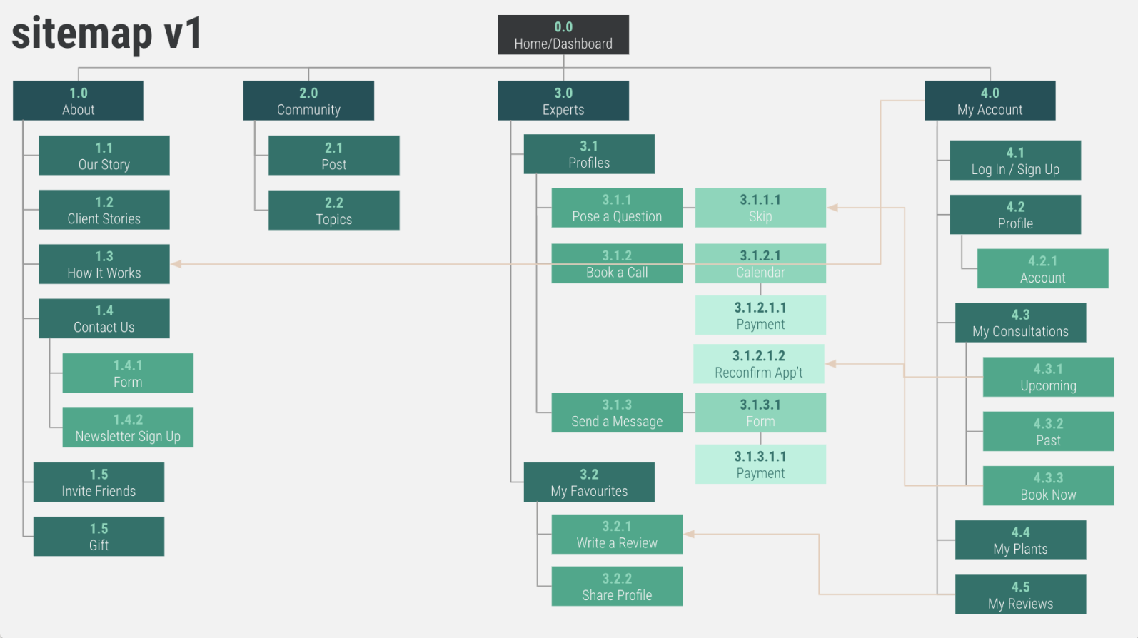
Lauren needs to schedule a consultation with an expert for advice on her houseplant woes. She is also keen to learn more about houseplants, and really enjoys connecting with a community. Below is the first idea of how Biophilia’s functions could be organized. With all the sub-pages, I clearly was getting caught up on some of the actions and content particulars within each page instead of looking at a high level hierarchy organization.
Biophilia sitemap, version 1
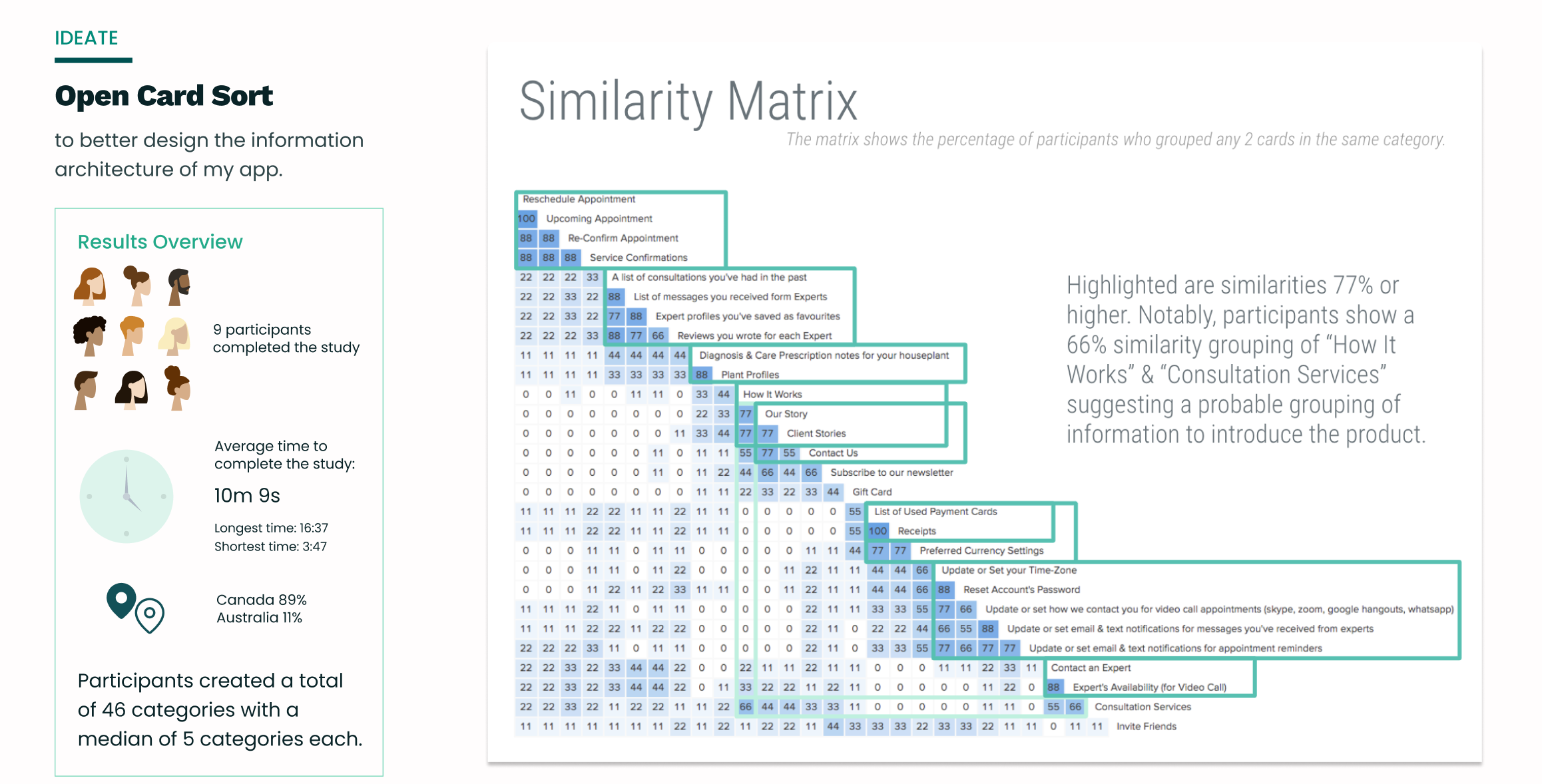
I needed to (in)validate my information organization. I was particularly curious about the placement of “Consultations” and “My Plants” within “My Account” - my logic was to keep personal preferences or saved items in a command centre, but could also consider any appointments or favourited plants as having a dedicated screen, perhaps once a member logs in. Additionally, I was curious about “Community” being a solo category. To test this out, I used optimalsortworkshop.com to host an open card sort.
If I were to go back and change some of the categories I chose to include, I would have released some of the cursory details such as ‘subscribe to our newsletter’ or all the account content and focused more attention to Experts, Plants, and Community because these categories’ impact is greater to the overall product. Regardless, the card sort help informed changes to the sitemap along with some additional reflection.
With consideration for Lauren and Hannah’s needs, I removed Community as a core feature and made it a complimentary sub-feature to Plants. From my user research, information about plant species and their care was an expectation, and Community, while desired by some, was not a priority for all. By having a Community function within Plants, it can uphold the expectation while also making space to connect with fellow enthusiasts about a particular plant. As one participant suggested, a community can function almost like comments or reviews beneath an online recipe, but for plants!
Biophilia sitemap, current version
-04-
DESIGN
WIREFRAMES & PROTOTYPES
Rapid Prototyping The Solution
Key Moments In User Experience
If you are curious to see more of my process work:
Low-Fidelity Paper Prototype
Mid-Fidelity Wireframes with Figma
Onboarding
The goal of onboarding is to introduce and set user expectations on a new experience; it also develops a continuous relationship with the user. Admittedly I started with modals to outline benefits once a user has created an account, but this was quickly abandoned. Typically the first interaction any user would have with Biophilia is through the homepage. So after commentary from my tutor, Maija, and further research into onboarding practices, I changed my approach and focused on progressive education through the homepage and empty states.
Onboarding Via The Homepage
PROBLEM: User’s don’t know what this new concept is, why they would want to use it, and how to get started.
So, what information is necessary for users to understand Biophilia’s core features?
Always return to your user data and remind yourself of the problem that the user is facing and what they need. Then, figure out how to reassure them through onboarding that the app does indeed answer their need.
- Germaine Satia, Smashing Magazine
The App’s Core Purpose: to connect houseplant parents to human Experts for personalized advice tailored to that specific houseplant in its particular (s)pot.
Other Considerations: need for tailored solutions, craving for community, and expectation for a resource with linear care instructions.
SOLUTION: Content copy to outline the Unique Value Proposition, The Benefits, and How It Works.
From my first iteration, the homepage was intended to showcase important information on Biophilia’s offerings to educate people on this new product. While the intention stayed consistent, the format and content saw some changes, notably:
After low-fidelity sketches, I added a section for Benefits, initially named “Supporting Your Plant Parenthood”. This was relabeled to “The Benefits” to be more obvious and was moved closer to the top to instil value and entice the user to learn more.
How It Works was reimagined into an accordion menu to highlight the key information into digestible 3 steps, which also helped reduce extra scrolling.
The Call To Action button label changed from “Get Started” to “Find An Expert” to better set expectations of the next step, which is to connect users to the core function.
Curious to see the evolution of the homepage? Click on Homepage JPEG to see how the content, format, and visual treatments developed.
Proof of Concept
PROBLEM: How can I create confidence in this new product?
SOLUTION: Proof of concept/a demonstration of the personalized care plan Lauren would get after a consultation with an expert; and customer reviews.
The Community Stories (testimony cards in carousel) may not have changed drastically, but the example of personalized houseplant care plan has!
Through my User Flows I created a path for finding and scheduling a consultation with an expert, and had thought of the high-level concept that users would get a personalized plan, but I hadn’t exactly imagined what that plan would look like after a client had a paid consultation.
Initially I imagined a document with coach marks, but this had limited organizational capability. From my user research, houseplant parents wanted information that was clearly laid out in easy steps; and that’s when I put the accordion menu to use. Lauren could see her care plan’s headings and expand for details, which would allow her to view the succinct content that she wanted.
The value of this section was validated during Usability Testing when participants considered this an important element when deciding whether or not to go forward with using Biophilia.
The Plant Experts
This function is the app’s core purpose - it is the solution to Lauren’s care advice roulette that is time consuming, confusing and generic.
Find An Expert
PROBLEM: Interviews showed that a major challenge was finding a qualified source to assist with a particular houseplant.
SOLUTION: To empower users to search expert profiles by criteria that is important to them.
To narrow down results, I implemented Sort By and Filter functions. Sort By are for ratings, recommended, years of experience, and alphabetical. Filter can be for plant specialities, types of credentials, ratings, and years of experience. This will help Lauren find an Expert who can take on her particular houseplant.
In both low- and mid-fidelity wireframes, the user flow was to go to the Experts page, followed with the choice to ‘find an expert’ or ‘view favourites’ with ‘how it works’ content directly below. After developing a design system to refine the prototype, I decided to implement a tab system to keep a consistent and therefore familiar format among other pages such as Consultations and Plants, but more importantly to reduce a click before users are able to view experts, the very content they came to the page for. I also removed the content of ‘how it works’ and replaced it with a link to the homepage content to free up screen real estate.
The Plants
Plants, after all, are the subject matter that brought users to Biophilia in the first place. It is the subject matter that Biophilia hopes to celebrate and save from the pitfalls of generic advice.
Plant Profiles With Community
PROBLEM: How can I make learning about houseplants delightful? User Interviews highlighted that complicated care steps were frustrating. How might I foster engagement? User Interviews also show that some participants actively involve themselves in plant communities to get advice and connect with others who have the same passion project.
SOLUTION: Break information and care advice into bite size pieces, and compliment each profile with a community section.
Accordion menus have become a hero within Biophilia. It has the convenience of of condensing information into bite-size pieces that interview participants craved, and enables easy browsing to pertinent topics.
Community within each plant profile connects houseplant enthusiasts on a common plant so that they can learn more and get inspired. The additional sort/filter function helps make content that much more relevant as well. The choice to include a community function within a plant profile was inspired by user research; and as mentioned in the sitemap discussion, having community within the plant feature is purposefully complimentary for learning more about a particular plant, while providing connection without making community a standalone feature. This way community and learning is streamlined, almost like being part of a Slack channel.
Other noteworthy inclusions are:
Call to action to ‘find an expert’.
Share the plant profile for an additional social factor that may entice new sign ups.
The ability to favourite plants so that users can readily view their plants that they have or that are on the wishlist.
As you can see these core features were iterated from low to high fidelity, however, the high-fidelity mock-ups didn’t finalize without testing.
USABILITY TESTING
How can I test my hypothesis?
What will help bring clarity to my proposed solution?
What I Did.
I hosted 6 millennials for Usability Testing to gleam how they navigated through the web-app information architecture, whether or not its functionality is clear, if they enjoyed using Biophilia, and to catch moments of friction. I started the usability test with an overview of the session, consent, open-ended questions. The meaty part of Usability Testing was around 4 scenarios, all coupled with direct tasks and finished with a Single Ease Question.
Usability Test Plan
Usability Test Script (with scenarios/tasks)
Consent Form
How It Went.
Overall it went well! Participants were intrigued by the concept, delighted by the easter egg hunt of plant puns, and despite the prototype being in greyscale, they really enjoyed the clean aesthetic. Most tasks were very easy to complete and the web-app content/information was noted as being useful and well-organized.
Lessons Learned.
The results from the usability testing indicate that there are healthy opportunities to modify log in and sign up processes (to distinguish the two), explain ‘Plant Academy’ and ‘Plant Society’ functions more clearly, educate on how one becomes an Expert to give more credibility, and to reformat the ‘set reminders’ portion of ‘consultation confirmation’.
I made sense of ~5 hours of data by sorting findings into a spreadsheet in order to prioritize my opportunities for improvement, which informed my design decisions.
Data Informed Design Decisions
The Usability Testing illuminated errors and the Rainbow Spreadsheet helped prioritize issues to address. Through testing, I also found that I was toggling between “plant community” and “plant society” and this inconsistency was confusing for participants (and me too!). At this point I wanted to hear from users which vernacular resonated with them more, so I conducted a Preference Test (spoiler alert: Community won).
After the Usability Test and Preference Test, notable changes include:


During Usability Testing I discovered that Biophilia’s vernacular toggled between “Community” and “Society” and this resulted in confusion. So I put it to the test with a Preference Test. In the end Community was voted for being more inclusive. I made adjustments to Biophilia’s content copy accordingly.
REFINE
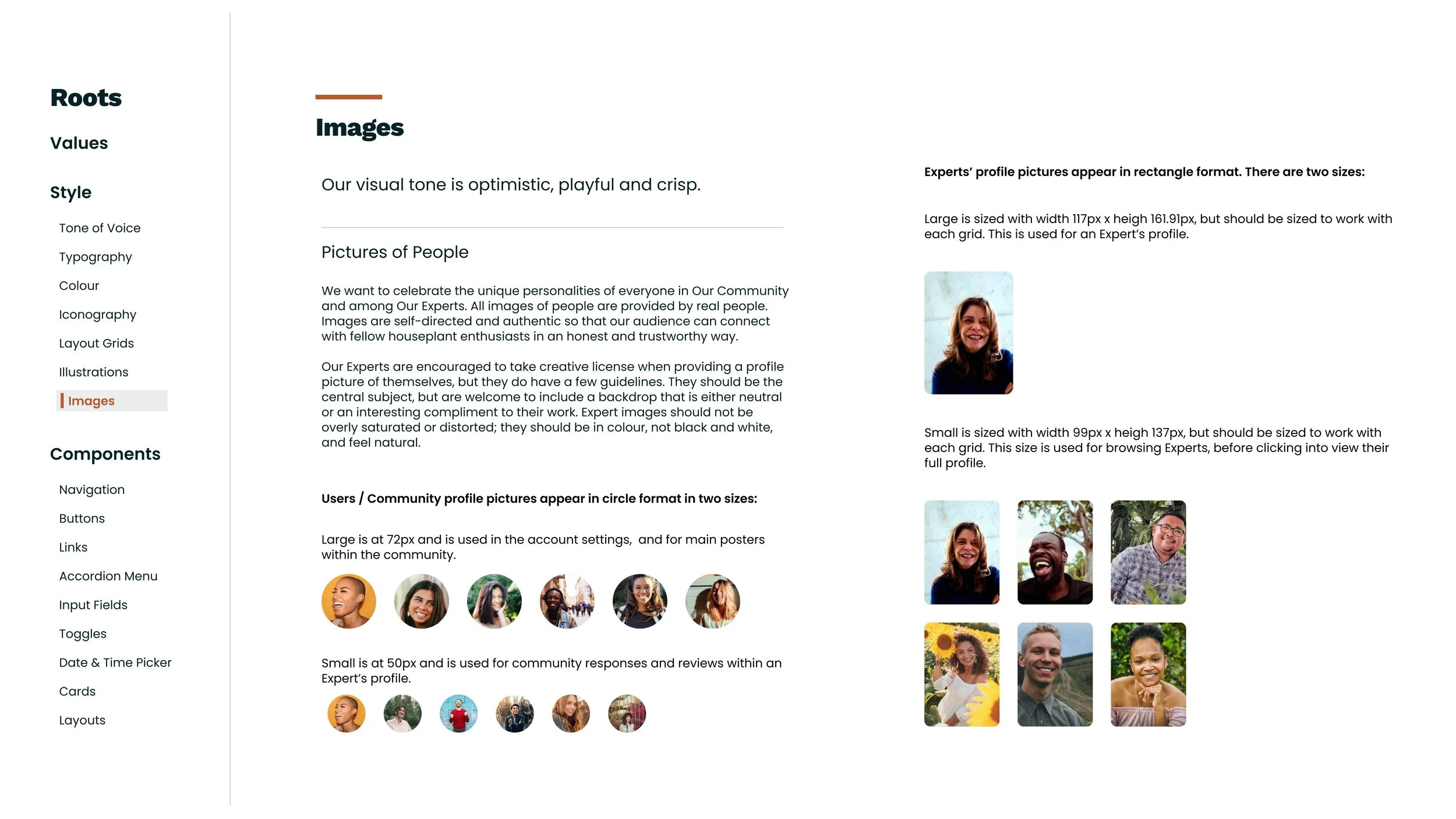
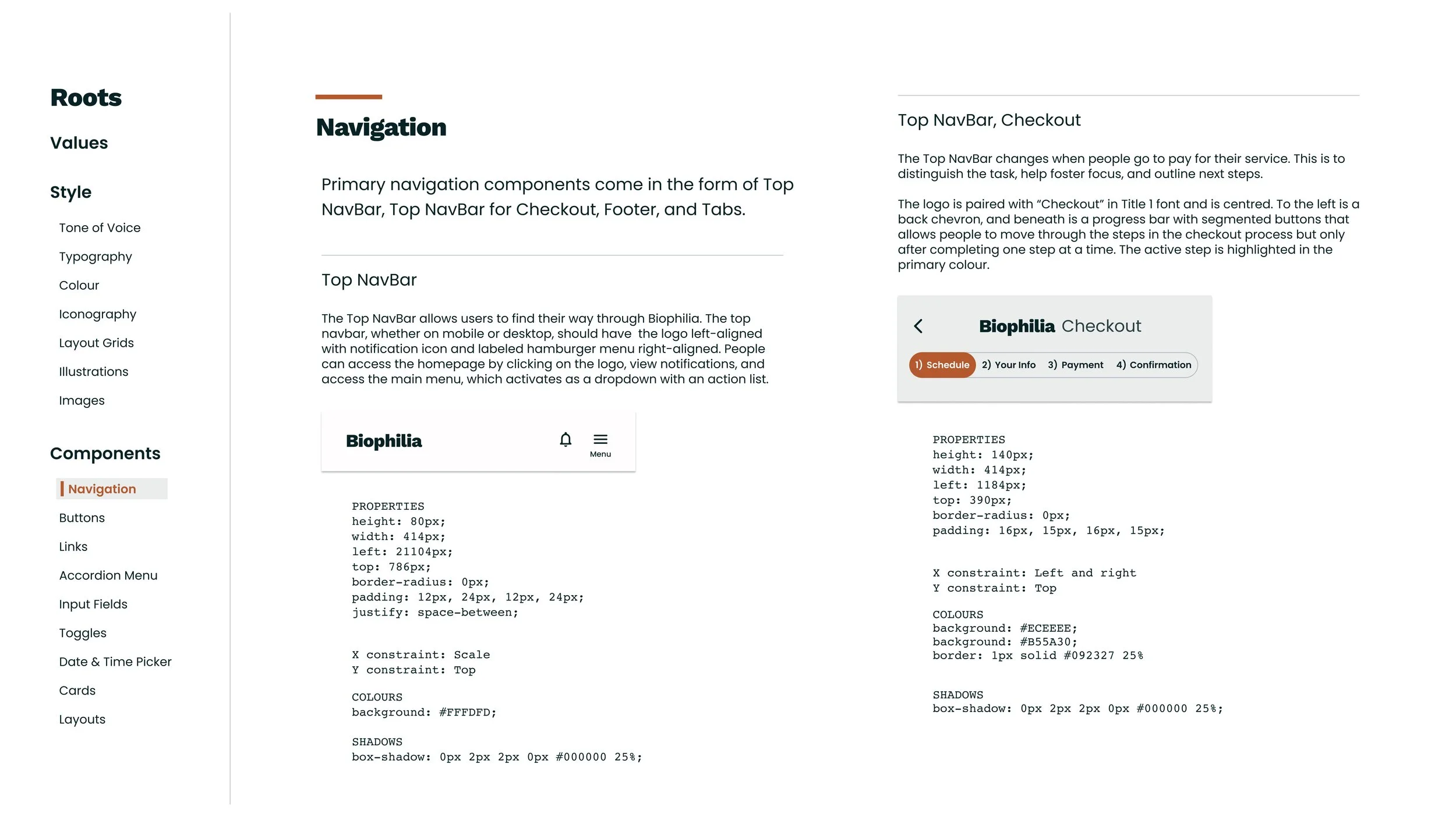
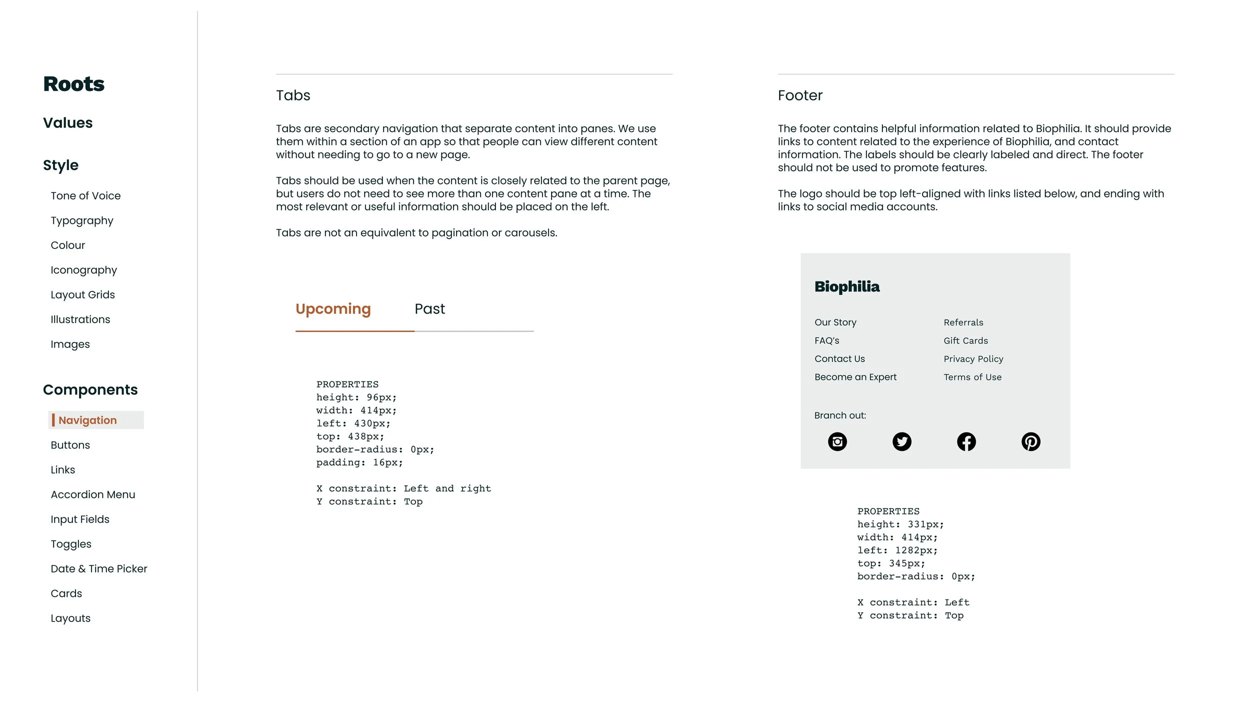
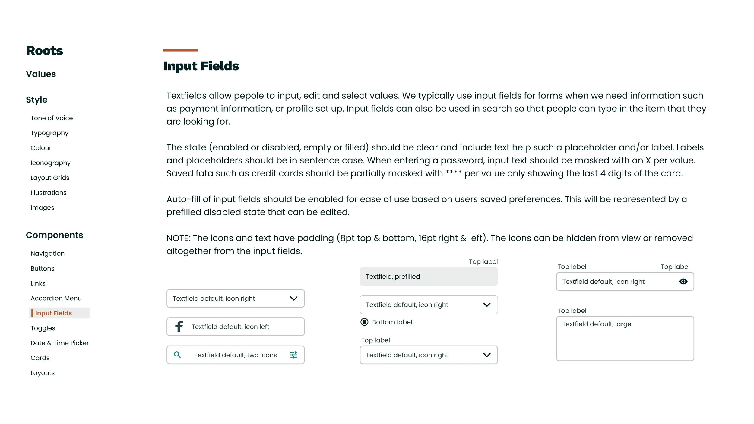
Biophilia’s Design System
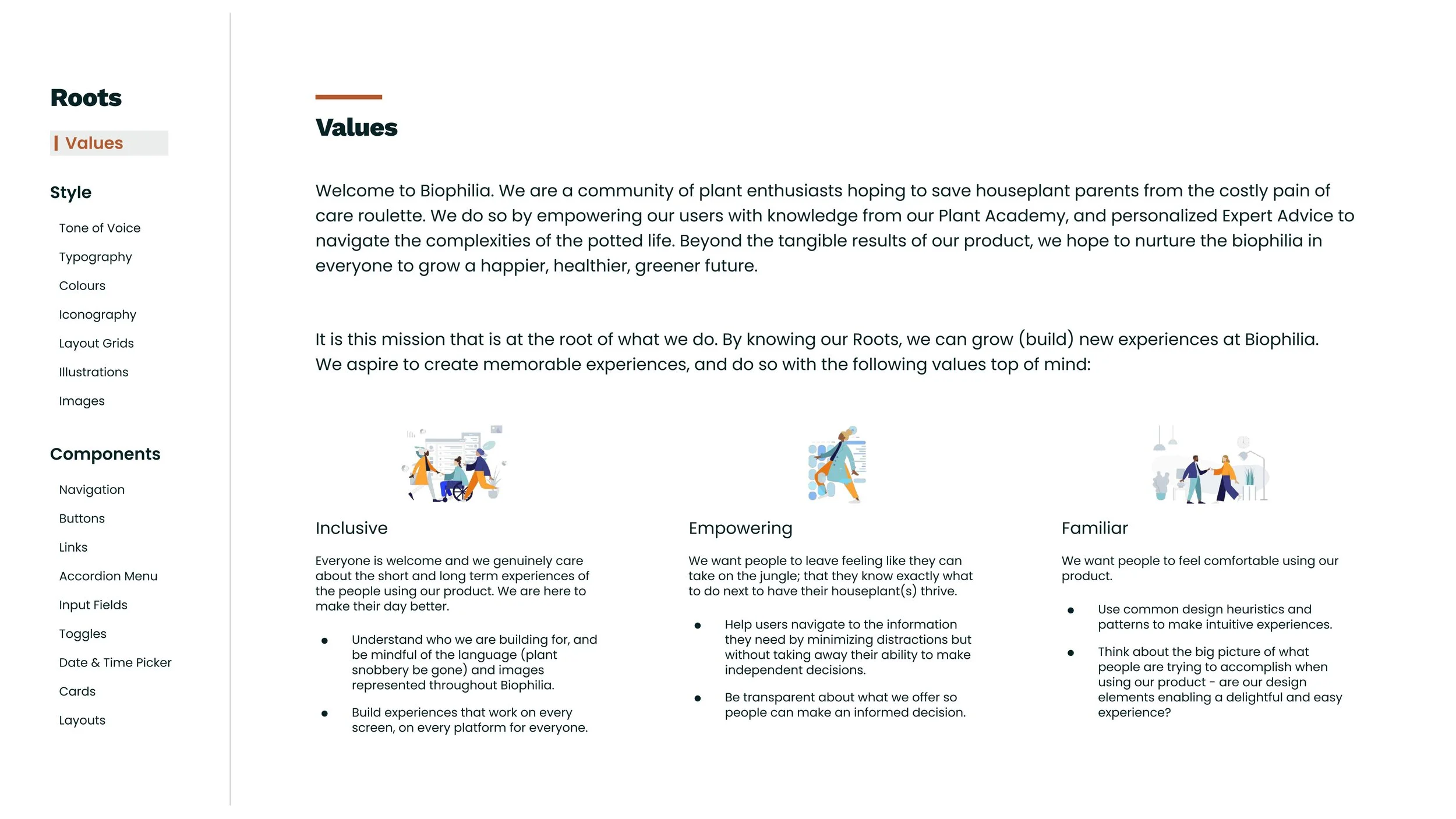
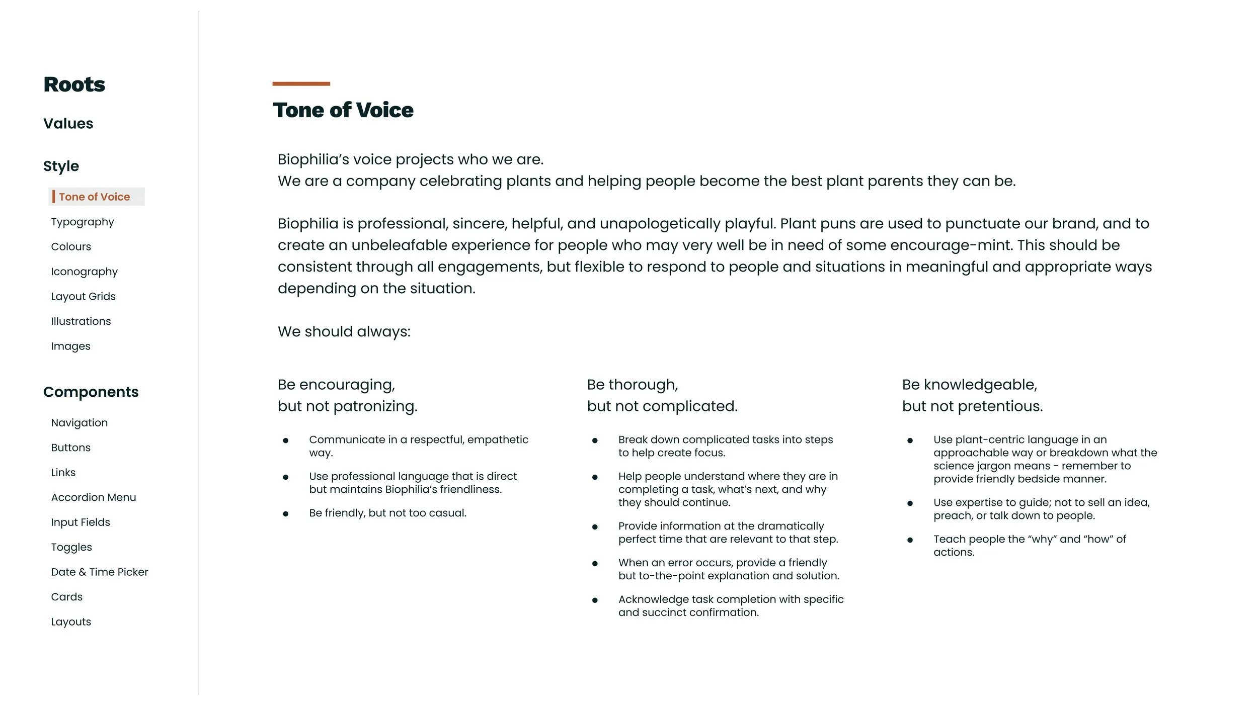
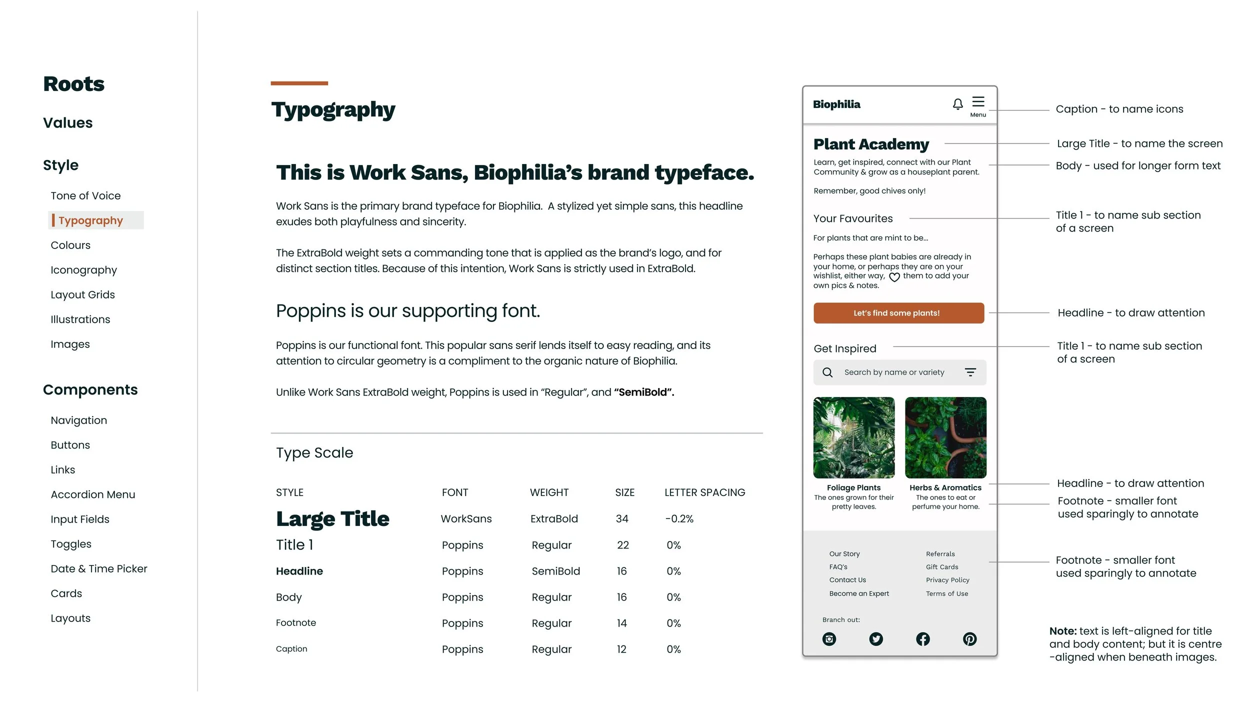
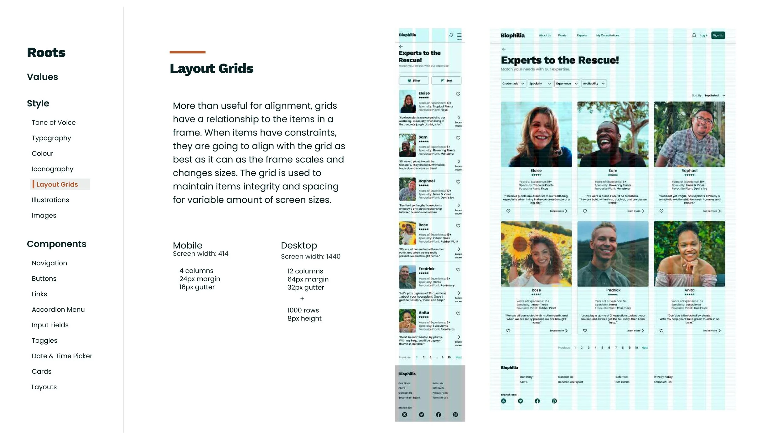
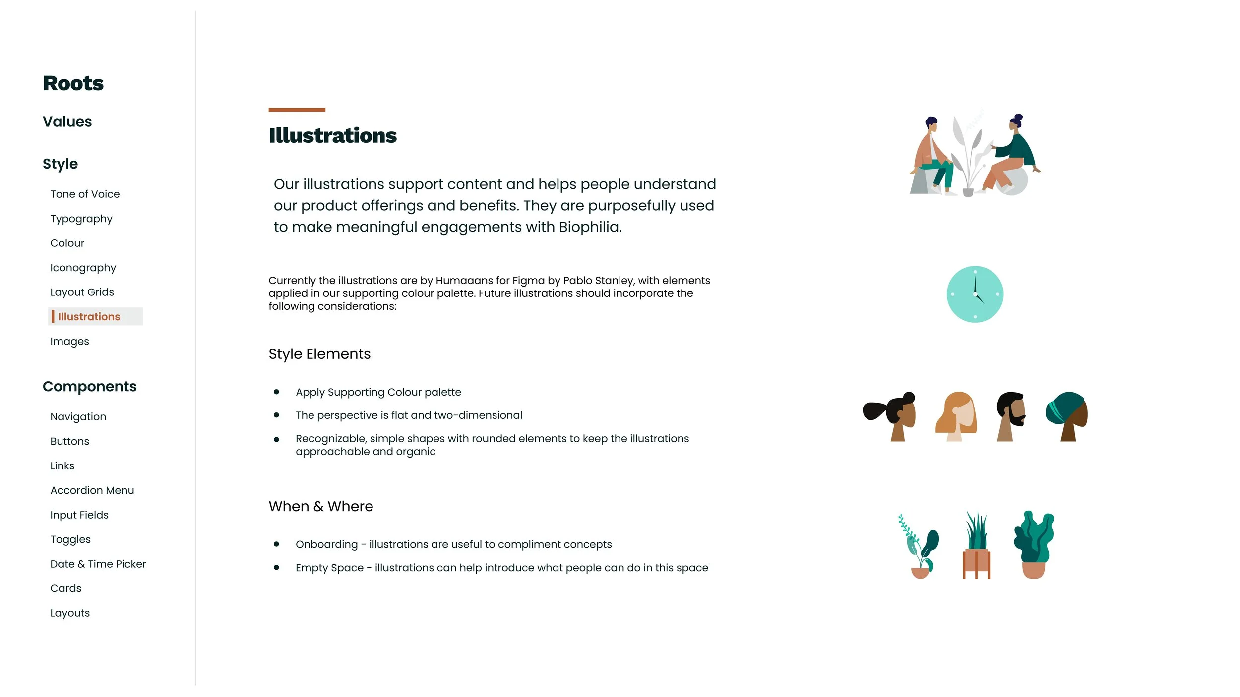
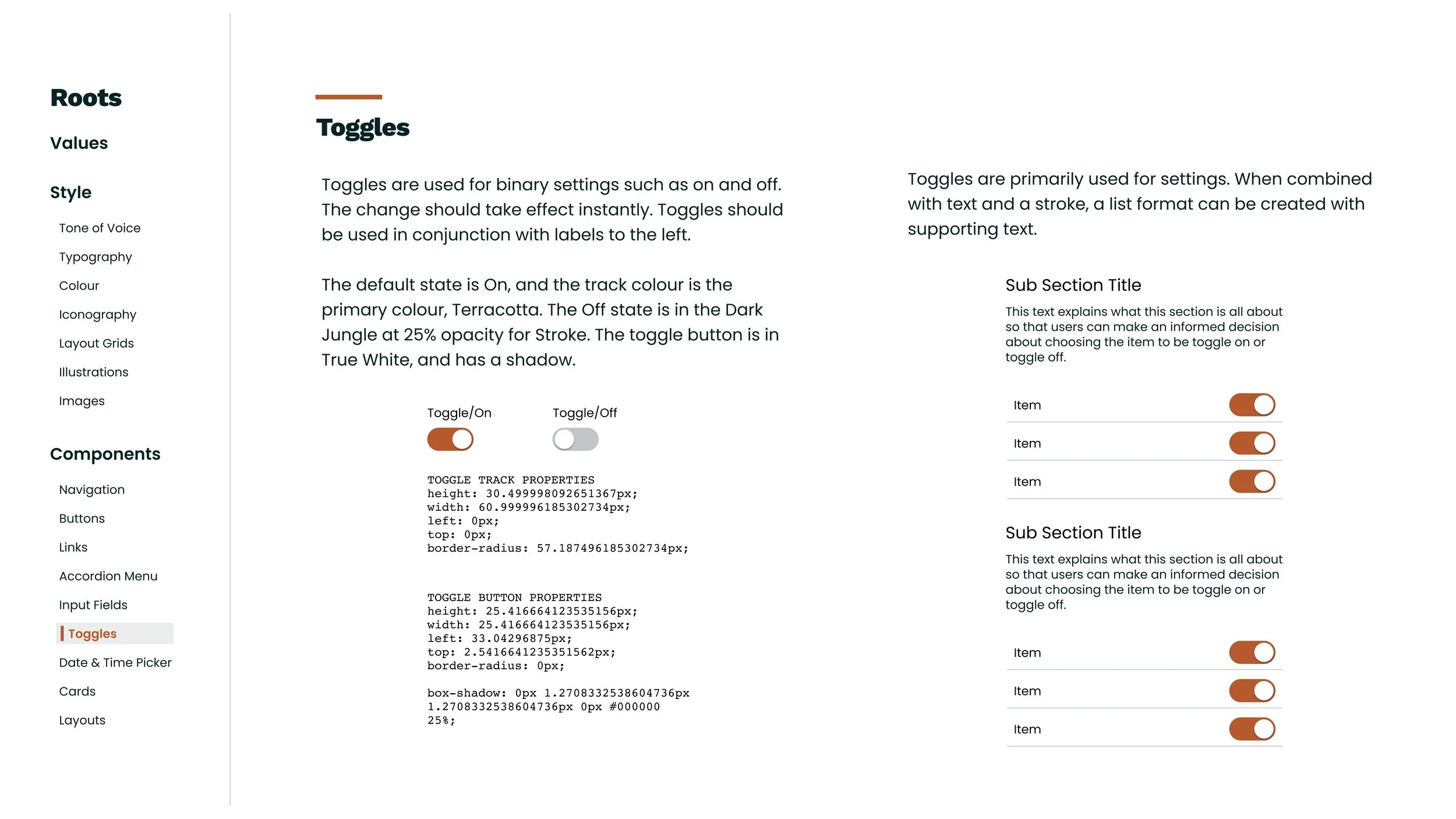
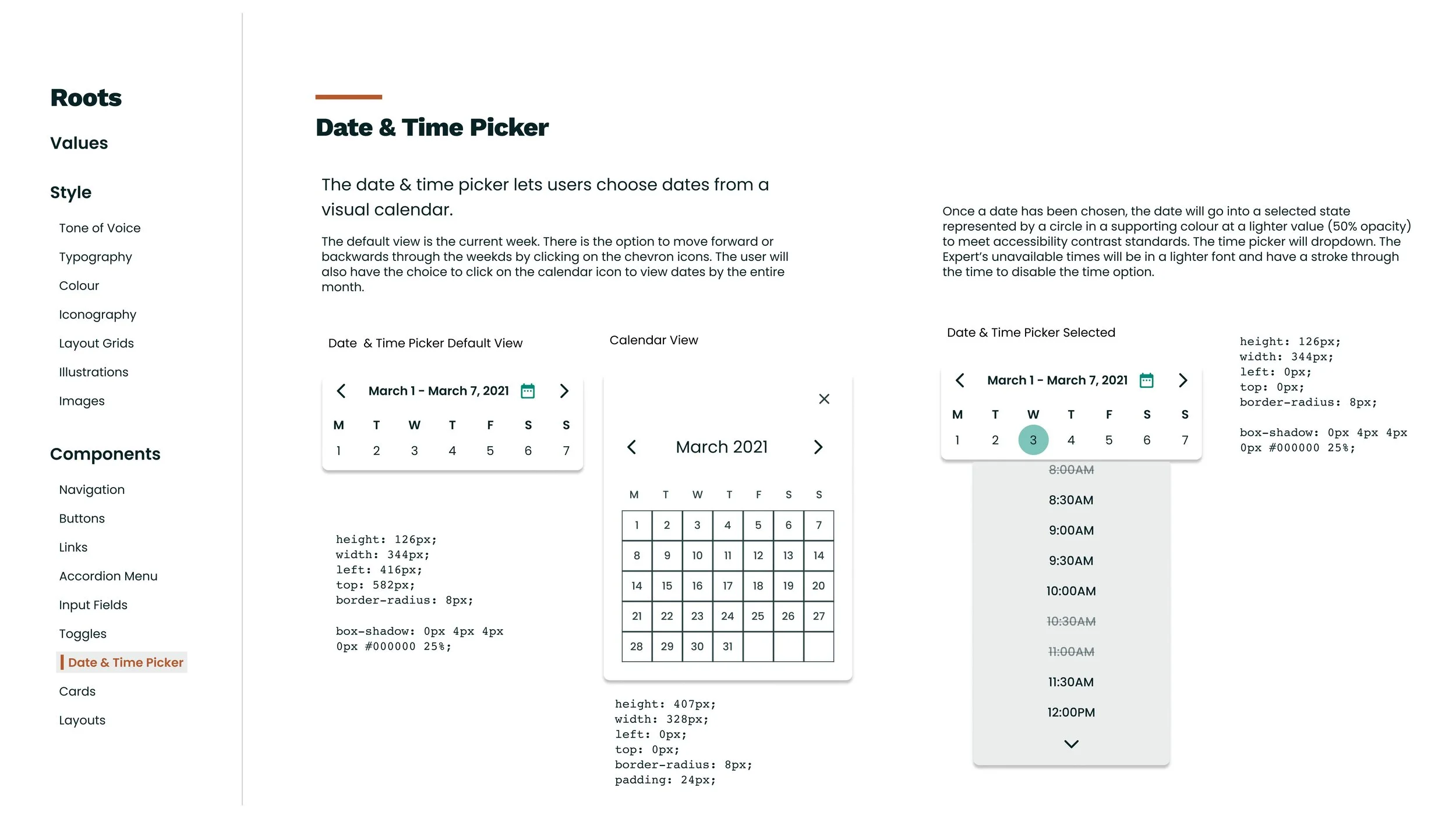
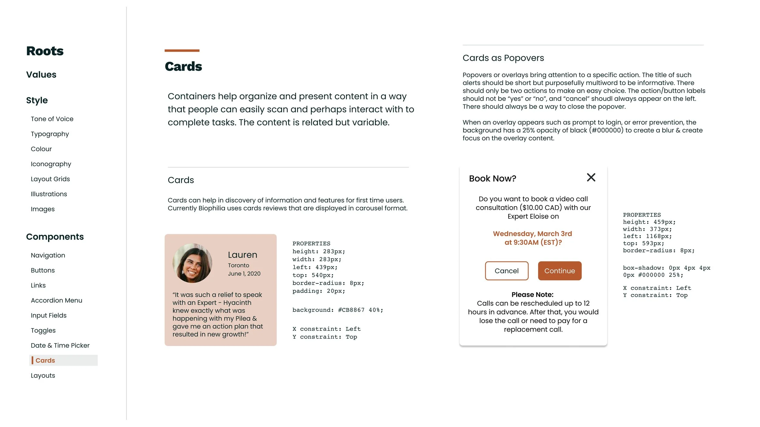
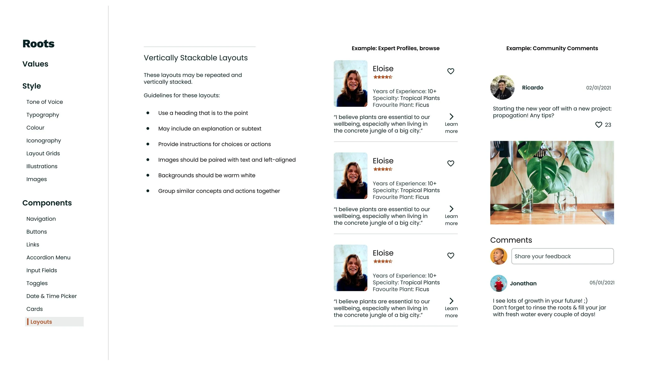
Roots
To create consistency in the product, and provide guidelines for future growth (mind the pun), I initiated design documentation.
-05-
DELIVER
The Solution
Biophilia is a mobile web-app that connects you to an Expert for personalized houseplant care advice, levels up your houseplant knowledge, and enables you to interact with fellow houseplant enthusiasts.
What I Learned
Test often.
To paraphrase my tutor, ‘if you wait until it’s perfect, it’s too late’. Essentially, you can build what you may think is the greatest product in the world, but if you don’t get out of your own mental model, and you don’t test your concepts early, you may be building the wrong thing. Does your product offer value? Does it address a problem with a viable solution? This is something that resonated with me from early stages in my UX bootcamp and I continue to release any ideas of perfection, instead prioritizing progress guided by process.
Data drives decisions.
Never assume. All design decisions should be informed by data and grounded in the user experience. When I clearly define my research goals, I can ask the right questions, and this can expedite the design.
Simplify.
Visualizing User Flows and the Information Architecture of the app was an early sign that I was getting caught up in details that perhaps did not impact the main features. An example of this is the time spent developing all elements of the Account. If I could go back, I would have alleviated myself from some of this design work in favour of core features. When in doubt, I will ask myself whether or not what I am doing will have an impact on the user experience.
